| View previous topic :: View next topic |
| Author |
Message |
sivipas
Snailer
Joined: 17 Oct 2007
Posts: 99
|
 Posted: Wed Apr 02, 2008 5:50 pm Post subject: AK400 'Gardener's Delight' Posted: Wed Apr 02, 2008 5:50 pm Post subject: AK400 'Gardener's Delight' |
 |
|
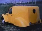
time to show some progress.
few months ago, my ak van looked like this:

the car was, well, basically sound but tatty around the edges. previous owner did some nasty things to the car - floors were changed improperly, so that pedal floor had to be hammered in order to make space for the front arms, ugly sunroof was cut in (and it leaked water badly), and I didn't like the green colour.
so, first a friend supplied a spare roof:

then the floors&sills were changed, roof welded, chassis cleaned and rustproofed and now the car is almost ready for painting.


I also installed another fuel tank for greater autonomy. the original one is in its place, and another one is added as in the berline.

the car will be now some sort of bluegrey-ish colour, and an oldschool logo of my garden design company on the sides. |
|
| Back to top |
|
 |
dago
Dropped
Joined: 26 Mar 2008
Posts: 241
Location: Suomi
|
| Posted: Wed Apr 02, 2008 6:18 pm Post subject: |
|
|
| Looks nice work. Keep posting pics. |
|
| Back to top |
|
|
Olli
Soviet-Finn Photoshoper
Joined: 25 May 2007
Posts: 2146
Location: Soviet-Finland
|
| Posted: Wed Apr 02, 2008 7:24 pm Post subject: |
|
|
Hey!
Nice job! Good that you did close the roof, I'm not fan of open roofs in
2cv Vans. There is great blue/greyish color in early 60's 2cv's Maybe
someone remebers the AC code.
-Olli
_________________
www.ollierkkila.com |
|
| Back to top |
|
|
sivipas
Snailer
Joined: 17 Oct 2007
Posts: 99
|
| Posted: Wed Apr 02, 2008 7:35 pm Post subject: |
|
|
I was thinking in this way:


maybe a shade darker and a bit more grey. it's difficult to decide from the miniature colour charts they have in stores, perhaps I'll buy a small can of paint, try it on some real part and then see if I like it. the color on first two photos is AC606, bleu glacier. |
|
| Back to top |
|
|
dago
Dropped
Joined: 26 Mar 2008
Posts: 241
Location: Suomi
|
| Posted: Wed Apr 02, 2008 7:55 pm Post subject: |
|
|
| Yap, i like that one too. Gray/blue. |
|
| Back to top |
|
|
dule
Lowered

Joined: 06 Jan 2008
Posts: 590
Location: Zagreb, Croatia
|
| Posted: Wed Apr 02, 2008 9:52 pm Post subject: |
|
|
nice work, i like the idea :) that grocery bag under the spare roof has just the wright words..."just for me" hehehe
did you maybe considered choppin it to a 350 instead of 400?
and show us the company logo!!!!! |
|
| Back to top |
|
|
sivipas
Snailer
Joined: 17 Oct 2007
Posts: 99
|
| Posted: Mon Apr 07, 2008 10:10 am Post subject: |
|
|
thiis how it should look when finished:

plus roofrack and maybe some more white detailing. rather than painting a real illustrated logo on the sides, I thought just writing the name of my company in Marcella font could work better. |
|
| Back to top |
|
|
Olli
Soviet-Finn Photoshoper
Joined: 25 May 2007
Posts: 2146
Location: Soviet-Finland
|
| Posted: Mon Apr 07, 2008 4:54 pm Post subject: |
|
|
Marcella looks fine but you should put capital letter on first.
Maybe could also be idea to ask some graphical designer to make you
"retro" style text of your company name. That you could use somewhere
else too?
-Olli
_________________
www.ollierkkila.com |
|
| Back to top |
|
|
max
Dropped

Joined: 01 Jul 2007
Posts: 332
Location: England
|
| Posted: Mon Apr 07, 2008 5:18 pm Post subject: |
|
|
definatl agree with the capital letter olli,
i like you calender... only just noticed it haha. |
|
| Back to top |
|
|
Punky
Dropped

Joined: 18 Jun 2007
Posts: 361
Location: Netherlands
|
| Posted: Mon Apr 07, 2008 5:22 pm Post subject: |
|
|
What are your plans with the roof. A hard roof at it is now, ore the vinyl roof from a berline? Like the photoshop?  |
|
| Back to top |
|
|
Olli
Soviet-Finn Photoshoper
Joined: 25 May 2007
Posts: 2146
Location: Soviet-Finland
|
| Posted: Mon Apr 07, 2008 6:49 pm Post subject: |
|
|
If you looks pics and read topic you would find
out that he just get rid of vinyl roof 
-Olli
_________________
www.ollierkkila.com |
|
| Back to top |
|
|
max
Dropped
Joined: 01 Jul 2007
Posts: 332
Location: England
|
| Posted: Mon Apr 07, 2008 6:55 pm Post subject: |
|
|
| do you want your own company logo to be dependant on the whole car look? because an old school font dosnt suggest garden design to me? it may look cool. but nothing to do with what you do? just a thought |
|
| Back to top |
|
|
Punky
Dropped
Joined: 18 Jun 2007
Posts: 361
Location: Netherlands
|
| Posted: Mon Apr 07, 2008 9:03 pm Post subject: |
|
|
| Olli wrote: | If you looks pics and read topic you would find
out that he just get rid of vinyl roof
-Olli |
Ok, I see now. Is was reading to fast and more looking at the pictures. |
|
| Back to top |
|
|
sivipas
Snailer
Joined: 17 Oct 2007
Posts: 99
|
| Posted: Mon Apr 07, 2008 9:05 pm Post subject: |
|
|
@olli - i'll have the logo designed later, for the moment i'll put it this way. I agree with the capital letter, but capital 'P' in Marcella doesn't look good at all to me.
@max - I see your point, but I do many different things. I'm a landscape architect, so garden design is one of the things I do. I make many handmade things of wood, I collaborate with architects on projects etc. so I don't want a logo to present a typcal gardening company. I made a blog recently, still have to put more things on - you probably don't understand croatian but the menu on the top right shows photos of what I do.
www.studioplantula.blogspot.com |
|
| Back to top |
|
|
Olli
Soviet-Finn Photoshoper
Joined: 25 May 2007
Posts: 2146
Location: Soviet-Finland
|
| Posted: Mon Apr 07, 2008 9:23 pm Post subject: |
|
|
How about this?

-Olli
_________________
www.ollierkkila.com |
|
| Back to top |
|
|
|


